New Movie Poster Round Up, May 30
Reading too much into this week's movie posters, from Wes Anderson's Asteroid City to the new Indiana Jones.
Some pre-post house cleaning:
Listen to me on some podcasts! Aside from brand new episodes of the Frotcast (this episode free; sign up on Patreon for the premium ones) and Pod Yourself The Wire with David J. Roth (early access on Patreon), I’m also on this week’s Film & Whiskey podcast talking about Point Break (which we all know is one of the greatest actions films of the 80s and 90s).
Send good vibes to Biff Wiff. The ‘I Think You Should Leave’ Santa Claus, who I tracked down for his first-ever interview a few years back, apparently is fighting cancer. There’s a GoFundMe and I checked with his manager to make sure it was legit and he said it was. Biff had a memorable turn on ITYSL and had guest spots on Dave on FX and in Everything Everywhere. Wishing him all the best.
Enjoying the recipes? I’ve been meaning to include a cocktail I’ve been enjoying lately in one of these, but I have to prep for a new Pod Yourself The Wire so it’ll have to wait for next time.
Okay, poster time! [All posters via IMPAwards]
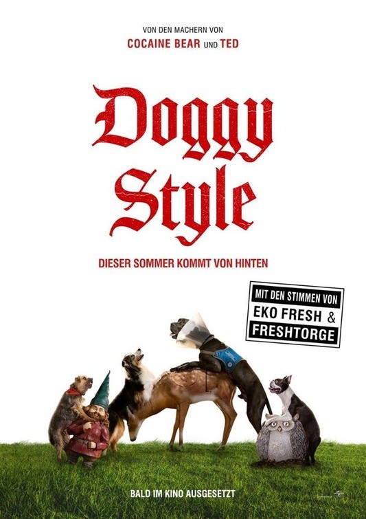
We begin this week with this German poster for Strays, which is apparently called “Doggy Style” in German. I’m pretty sure “Doggy Style” is still English (“hund” is German for dog), and it hurts my brain a little trying to figure out the market research and cultural assumptions that went into this titling decision. My best guess is that Germans aren’t familiar with the concept of “stray dogs,” but can easily translate most sex terms into at least six languages.
It seems so cosmopolitan to just have the title in a different language like that, and yet the poster clearly felt the need to show all four dogs trying to have sex with something (not each other!) in order to convey the concept of “doggy style.” Erect dog penises, implied penetration? Totally cool to show on a poster in Europe! God, they’re living the life over there, aren’t they? Nothing but paid vacations and overt sexual innuendo.
“Eko Fresh” is apparently a German rapper, and “Fresh Torge” is a German comedian, incidentally. “Ja, so za dogs haff sex oont also zere iz ziss really kool DJ…”
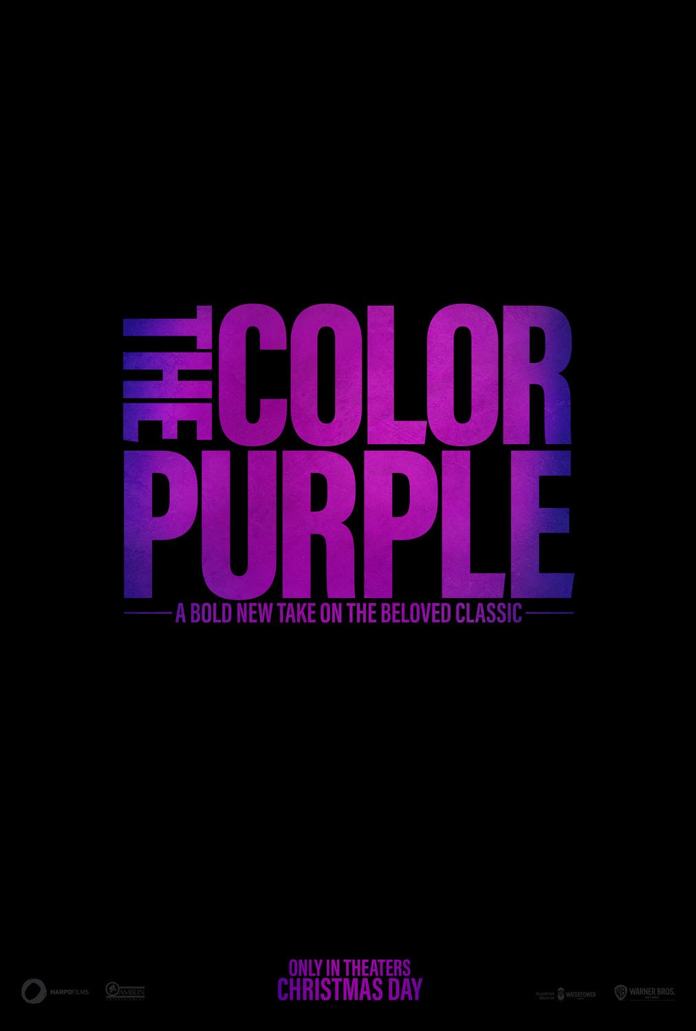
Quite a minimalist poster for The Color Purple. I hear it’s a bold new take on the beloved classic!
But what’s the bold take?? Who made it?? Who’s in it?? Is it animated or live action?? They’re really banking on the whole curiosity gap thing with this one, aren’t they. Some cursory Googling tells me that this is actually a film adaptation of the stage musical version of The Color Purple, which ran on Broadway in the late aughts. I never saw that one and basically didn’t know about it until just right now, but all I can think is that you have to respect the artistic hubris of anyone who sees a work about sexual abuse and thinks, “hey, you know what this could use? some songs.”
“Ride or die,” get it? That’s a commonly used phrase! And it can be applied to Fast X, because it’s a franchise about riding in cars, in which people are always trying to not die (there’s a Paul Walker reference here that I’m not going to make to prove to prospective employers how unproblematic I can be).
Anyway, totally applicable! I’m surprised they went with this and not RIDING IN CARS WITH BOYS.
Am I crazy or do Vin’s lips somehow look simultaneously dry and shiny? Oh God, they’re following me around the room.
Here’s the latest 4DX poster for The Flash, which features colors shooting everywhere! Starring… Ezra Miller! Michael Keaton! Supergirl (Sasha Calle)! And… uh… the bat plane! Did they not have a fourth actor they could’ve put there? That has to feel bad for the supporting cast.
(*whispers to date*) There’s bat plane.
I’m really getting that the Bat Plane is more important to this film than I would’ve thought. Yeah, yeah, it has a couple actors in it or whatever, but also BAT PLANE!
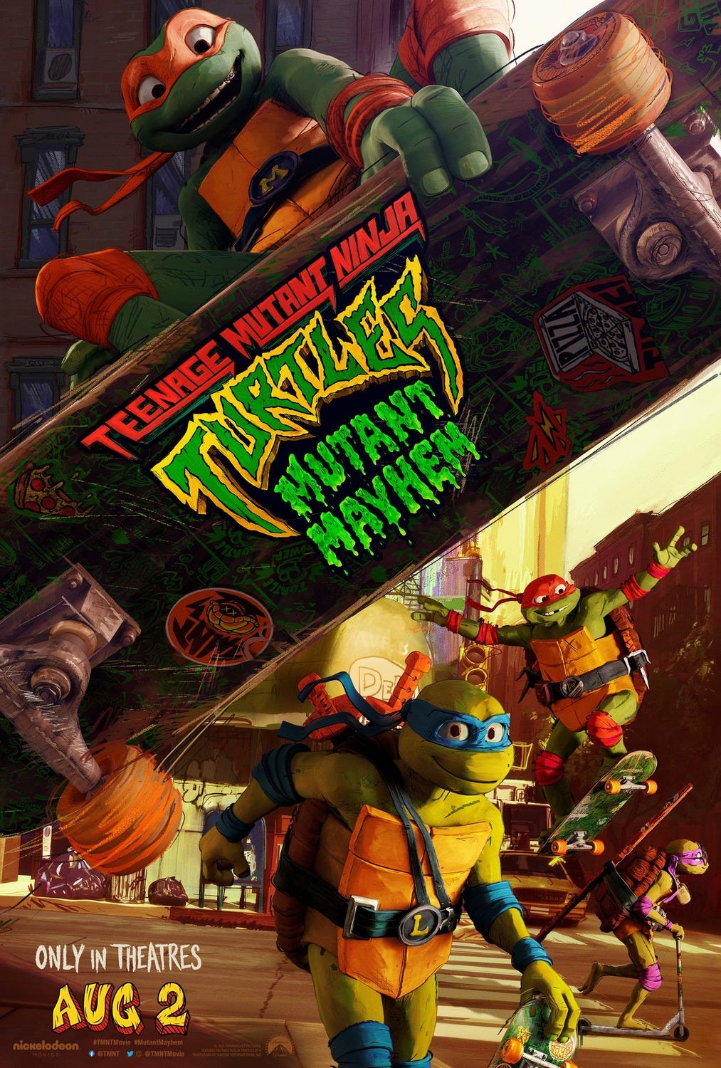
Jesus, how many different Ninja Turtles movies have there been now? According to Wikipedia (which is weird to quote, but shockingly accurate when it comes to stuff like this), there were the three live-action movies in the 90s (when I went to the Gathering of the Juggalos in 2013, Vanilla Ice promised to reveal the secret of the ooze at the beginning of his set), two mo-cap movies in 2014 and 2016, and animated versions in 2007, 2022, and now this one.
My guess, someone saw Lord and Miller make Into the Spider-Verse and thought “what if we threw Seth Rogen at the Ninja Turtles?”
That all makes sense, but I also think being constantly invited to play “fantasy studio exec” like this is ruining movies. I don’t care about the plan to squeeze more money out of the Ninja Turtles, I just want to watch a good fucking movie.
I hope the writers get everything they want in this strike because I miss when projects like this were considered beneath people of a certain stature. I mean the animation looks cool and I’m happy (genuinely) to see Seth Rogen “get that bag,” but I’d still probably rather see something else he was doing than an… eighth(?) Ninja Turtles movie? Hell, give me Sausage Party 2.
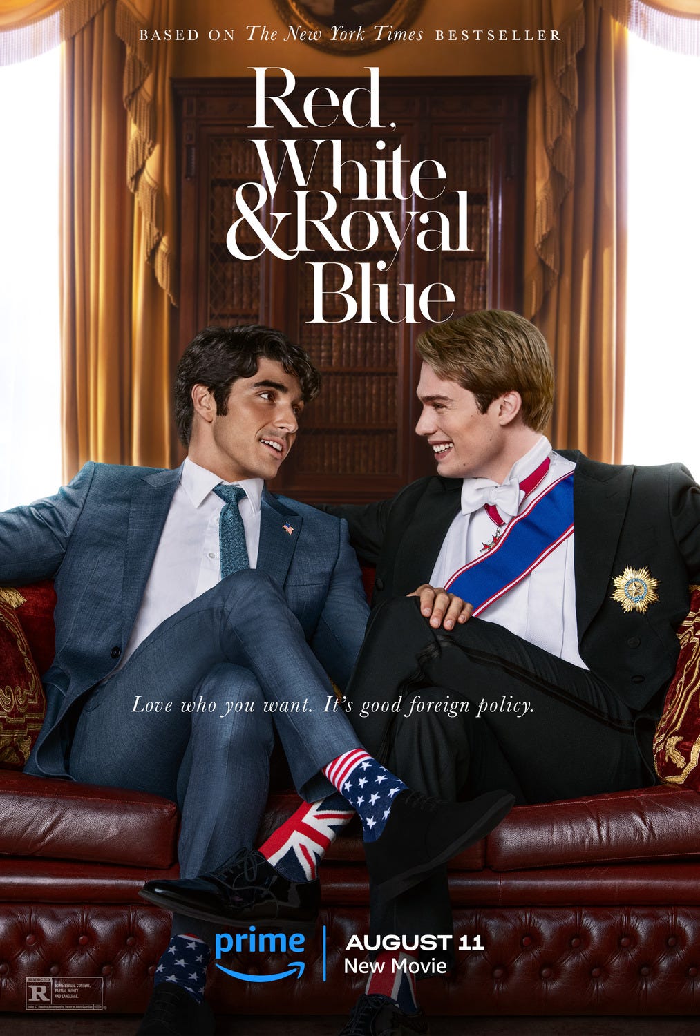
This looks so photoshopped. Those torsos are too big for those foreground legs! What are those, legs for aunts? And zero chance that hand was really on the thigh in the original shot. Also, where is all the back light coming from? Is that a magical door? Are they sitting in a light room?
This feels like someone had a very specific idea for the pose that should be in the poster and the designer just had to stitch it together from like seven different pictures. Maybe just draw the whole thing next time?
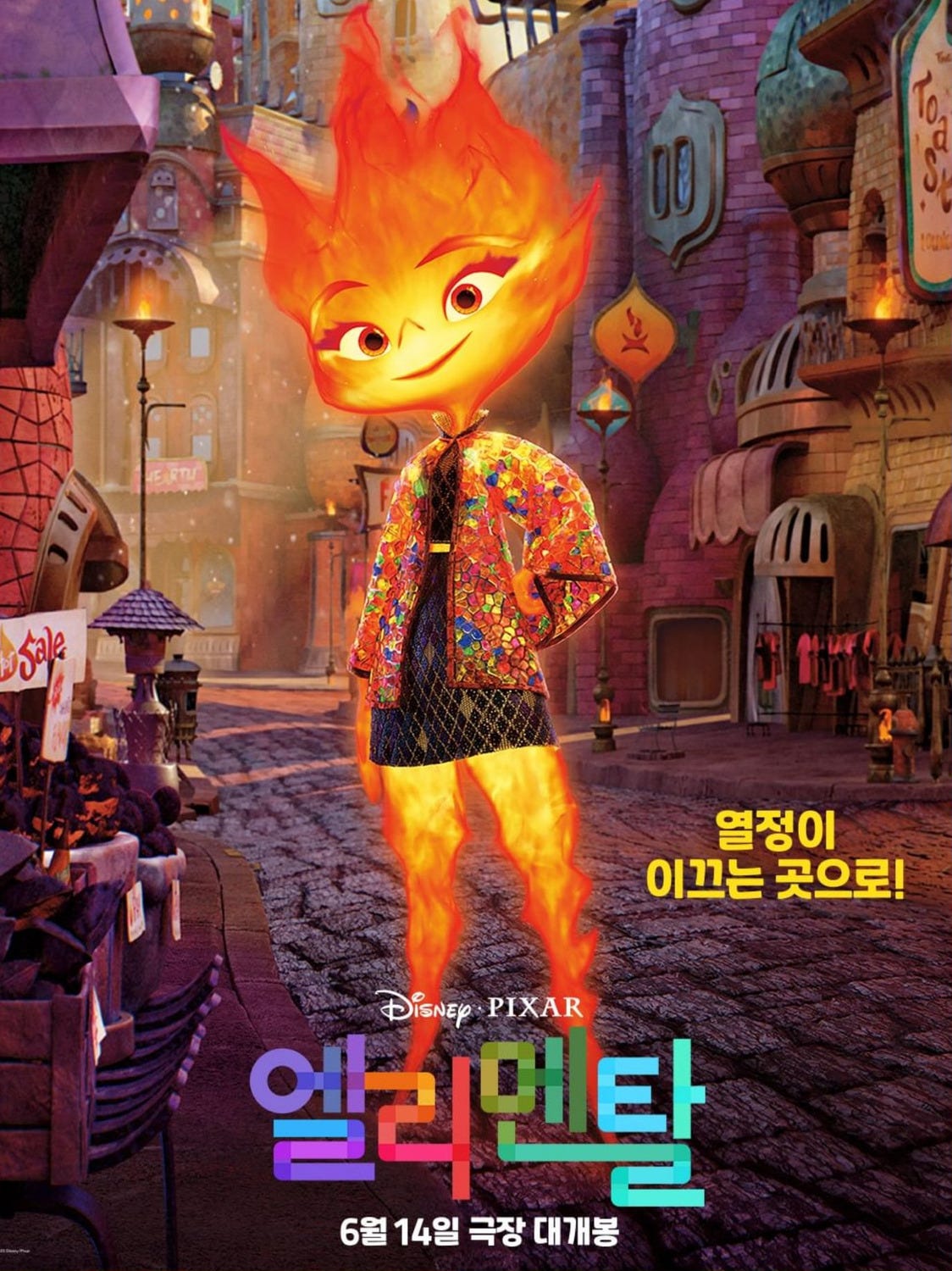
Here we have another character poster for Pixar’s Elemental. With all due respect to the massive teams of animators probably being exploited for this, the character design on this seems… tragically dull? It looks like a badly Photoshopped jack o’ lantern. Character design seems like a strangely frequent blind spot for Disney/latter-day Pixar. I’ve had lots of time to ponder this while my toddler son has been watching Moana roughly 100 times a week. It’s such a great concept and so well done in most respects, but Maui’s weird scrunched-up face bugs me every time. He’s a major character and genuinely off-putting (with an admittedly great intro song). Despite the insane man-hours that go into these things there are times it feels like no one ever stopped to ask “Hey, what if the characters were actually fun to look at?”
Counter-example: Zootopia. So many brilliant character designs in that one (more movies about anthropomorphic animals! I will keep screaming this until I get thrown in some kind of furry sex dungeon!). There’s a checkout guy at my local grocery store who reminds me of the DMV sloths every time I’m in there.
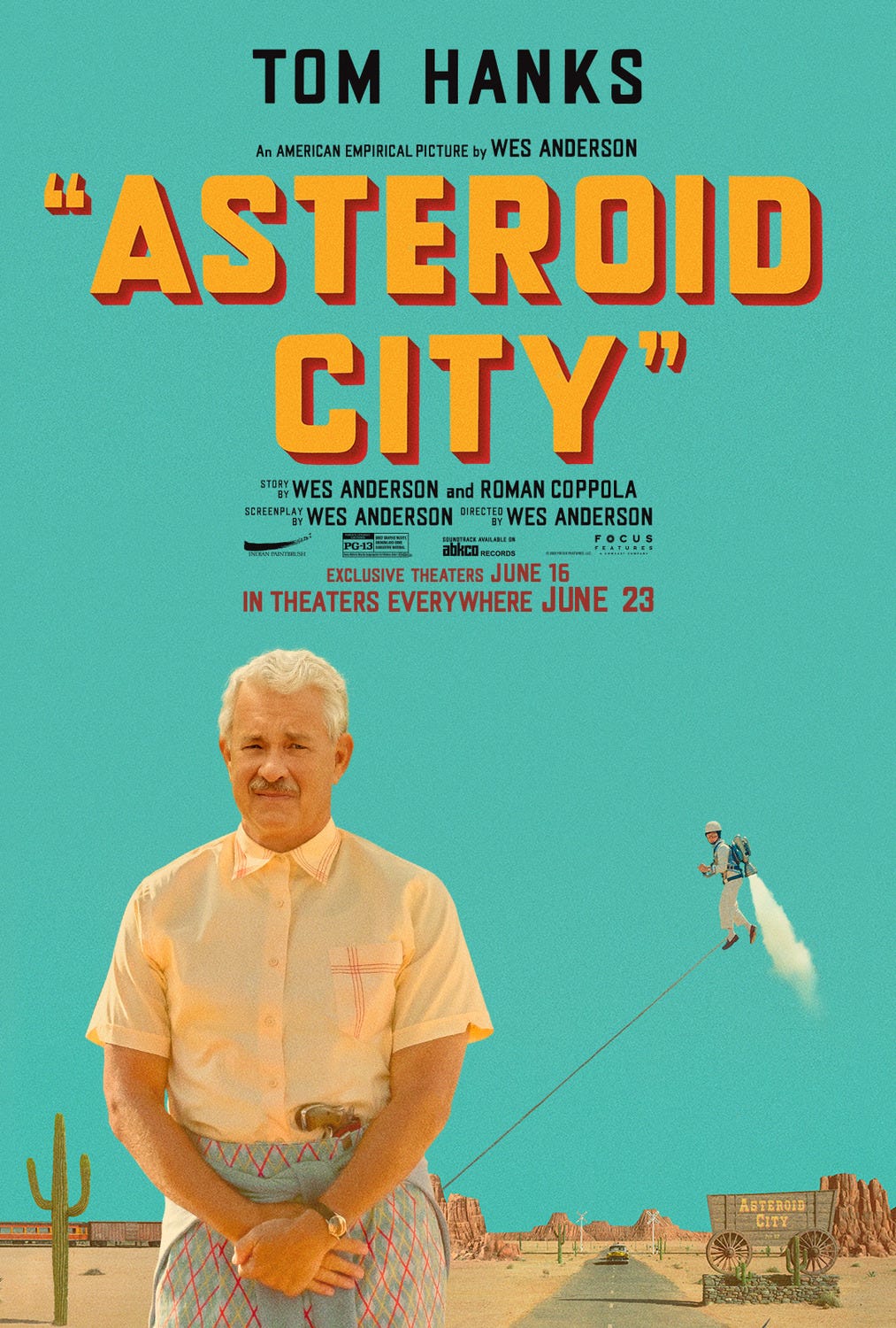
Does Tom Hanks have a jet pack leash attached to his butt? Anyway, it’s hard to beat Wes Anderson for aesthetics, I don’t care how parody-able he is. There are so many magical things about Tom Hanks’ outfit in this (and this is coming from a staunchly anti-top button buttoned guy), from the color scheme to the gun. But if I had to choose just one to love, it’s the sweater tied around the waist as a fashion statement. If tying a warmer article of clothing around your waist when you get hot comes back in style there are a lot of people in my life who owe me apologies. (I like to have my hands free! Let me live my life!)
Whoa, who are these turtles? He’s totally in my face!
Kinda looks like they’ve been skipping leg day, I dunno.
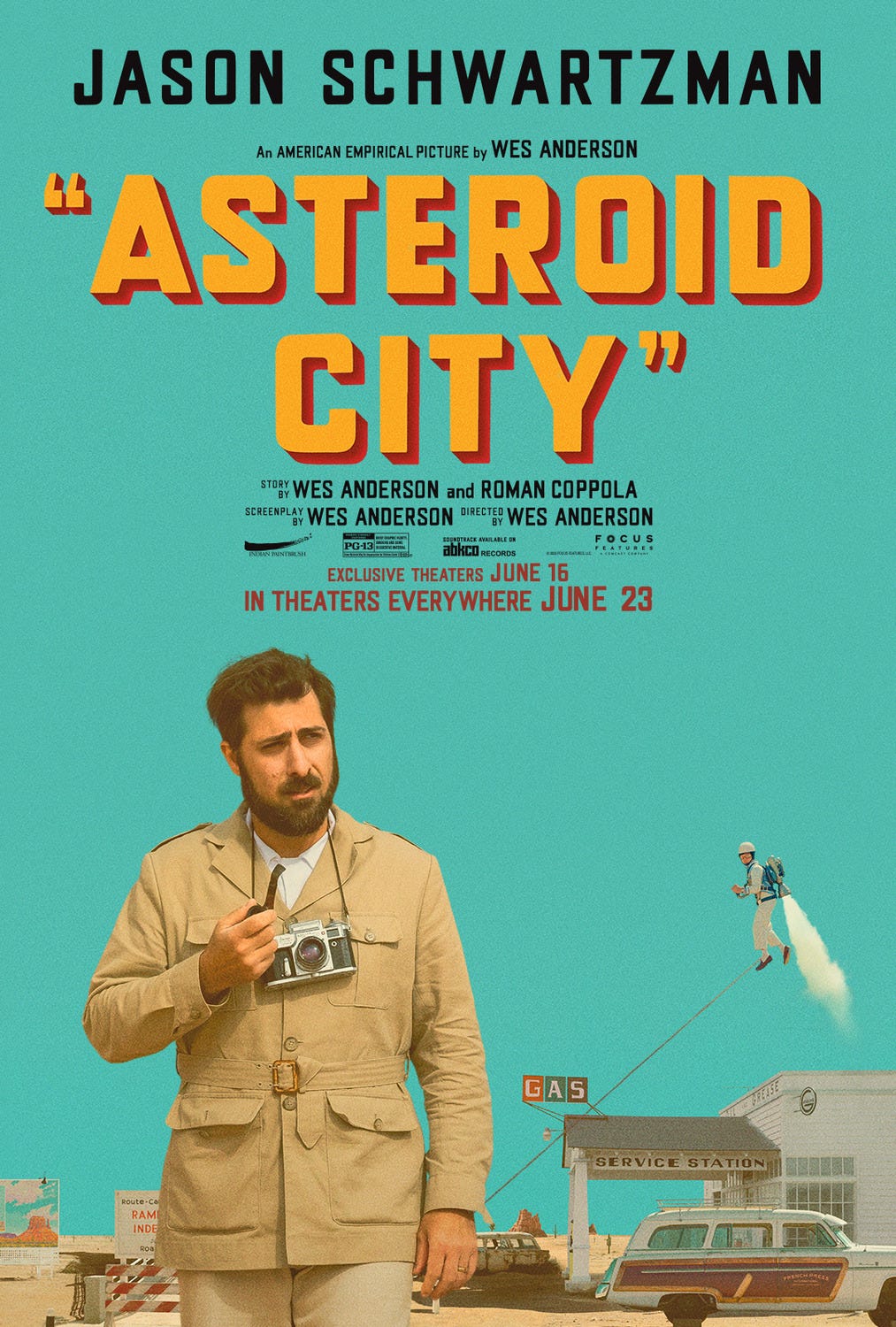
I feel Jason Schwartzman in this one is just how Wes Anderson dresses normally. I wish I could commit to anything the way Wes Anderson commits to the Wes Anderson aesthetic.
At least they did Scarlett Johansson the courtesy of not having the jet pack leash lead to her crotch. I guess it still points at it.
It’s a silhouette inside a silhouette! Halo inception!
I don’t have a clue what this movie is about, but everything about the poster intrigues me. The most straightforward idea in it is that Lady Liberty has an evil shadow. I don’t even know what’s going on with the collars, and I feel like having Tilda Swinton, RZA, and Isabella Rossellini in the same movie crosses some kind of famous eccentrics rubicon. But I guess when you get right down to it, it looks like a movie about a weird little guy, and I’m a sucker for a movie about a weird little guy.
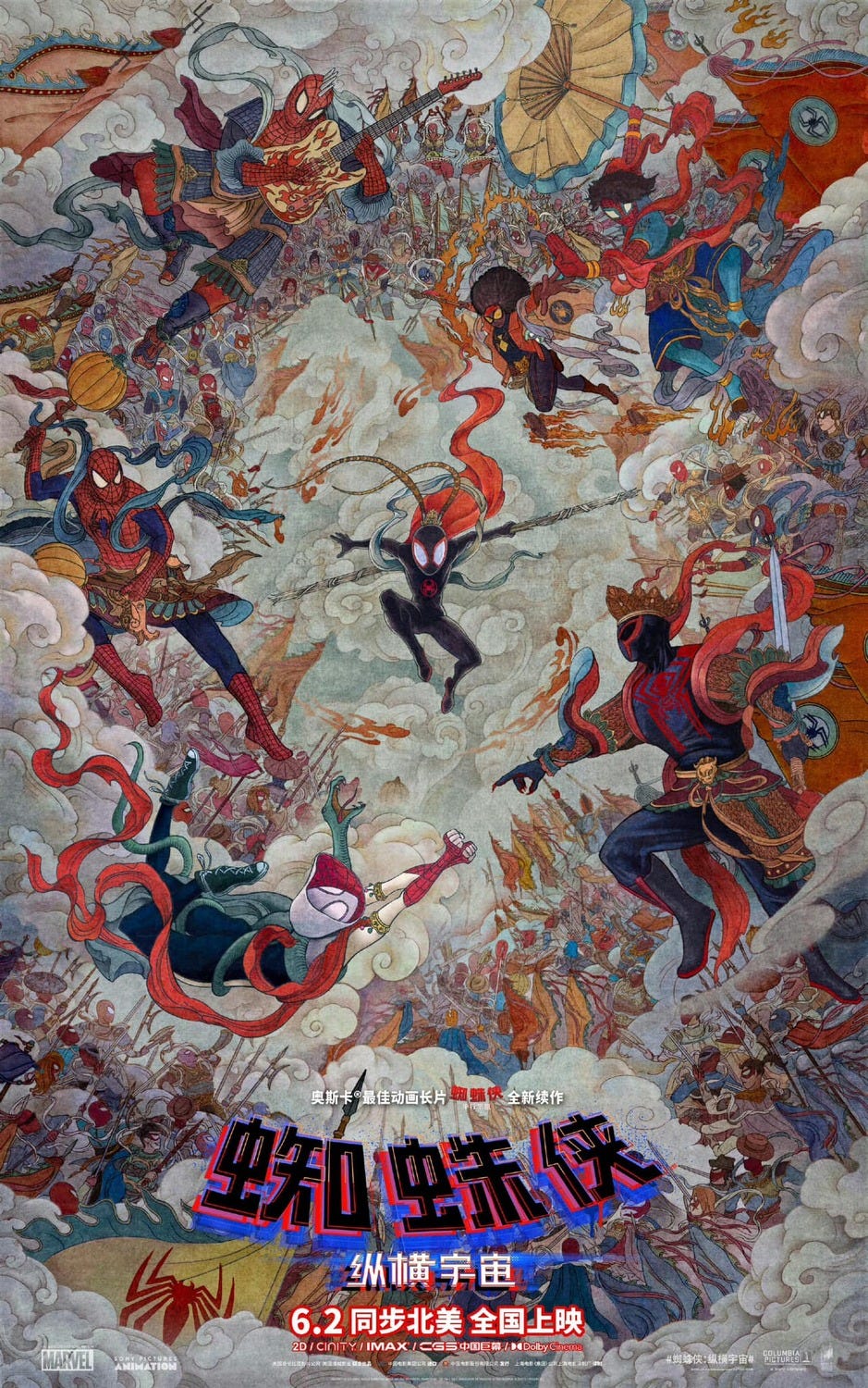
It feels like there have been a hundred different posters for Spider-Verse 2 (aka Spider-Man: Across the Spider-Verse) and all of them sublime. This one is like… Sistine Chapel meets Escher meets the album cover for Dookie? Incredible stuff.
The Little Mermaid opened this weekend, which I assume you all saw, if only to keep the racist trolls from winning (is there a way Disney lazily double charging for their IP and the racist trolls could both lose? Maybe the AI will help us figure that out). Whatever you think about that, I think we can all agree that the right eel kind of looks like Beavis from Beavis & Butt-Head.
Obviously this is a very straightforward poster advertising a film from Ken Burns, our most straightforward filmmaker. I will almost certainly watch this at some point, realize it consists of 12, 90-minute episodes all composed of still-image montages and then quit two episodes before the end. Good pitch though! “Buffaloes, huh? Sounds cool.”
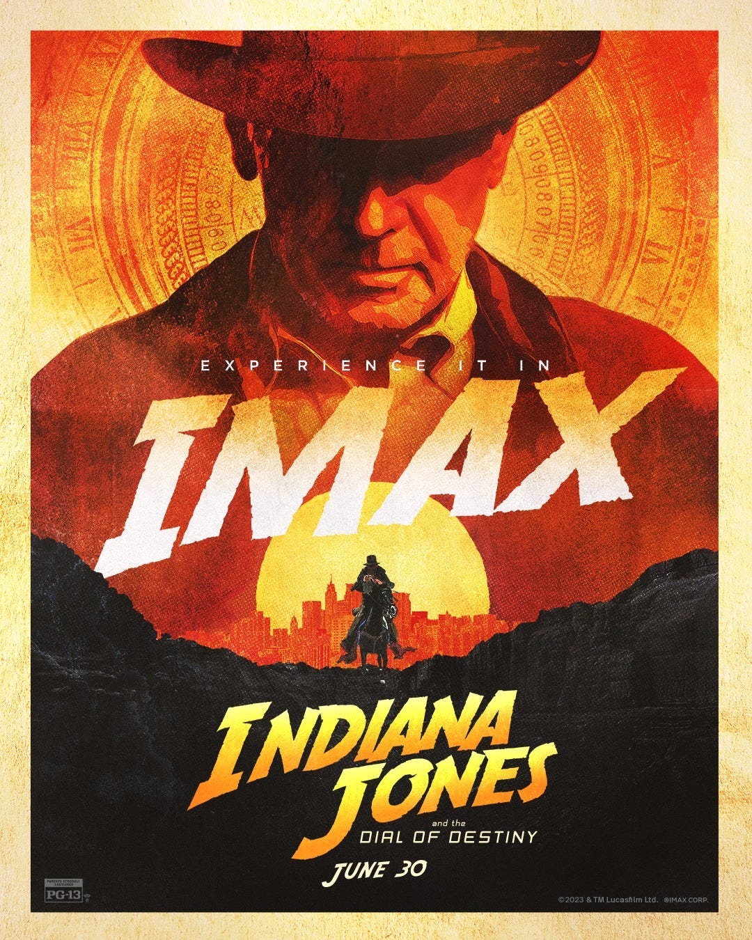
At this point I feel like Indiana Jones is almost more iconic silhouette than movie franchise. It might have the best branding (song, logo, Halloween costume potential, etc) of any movie outside of Ghostbusters.
Have you seen the clip from this one, where they’re just having a full-on conversation in the middle of a car chase? We’re also just pretending Harrison Ford can swing from lamp posts and jump from moving car to moving car still, I guess. As a washed dad with a constantly sore back, I think it’s the abject refusal to acknowledge aging I find depressing. Like… couldn’t you just write a version of Indy that’s not doing parkour and stuff?
Design some actual old-guy stunts! The creativity those limitations require might actually do the story some good! Instead they just write the same kinds of action and use greenscreen and CG to make it look like Harrison Ford is in them, which is boring because it’s the same old stunts that are always in these movies, only even faker-looking. They’re the action-movie equivalent of those booths at the fair that would put your face on a Sports Illustrated. Look, it’s Harrison Ford doing parkour! Carpool Karaoke-ass action movies.
Okay, that’s it for now, it’s the Tuesday after a three-day weekend and I’m tired. Top Chef recap coming at the usual time.








Is there a way they can just have Harrison Ford argue with Sean Connery's skeleton for a few hours? God The Last Crusade rules.
I, too, am a parent who has seen Moana a thousand times, but I think Maui's design is great. He's expressive, believably super-strong, and looks refreshingly different from any other character I can think of. What more do you want? If we're gonna change anything from the movie, how about losing the piglet who's there for 5 seconds just so they could make toys?