This Week In Posters, May 20 2024
Bad Boys! Deadpool Vs. Wolverine! J.Lo doing a Ripley! All of the things.
Welcome to The #Content Report, a newsletter by Vince Mancini. I’ve been writing about movies, culture, and food since the aughts. Now I’m delivering it straight to you, with none of the autoplay videos, takeover ads, or chumboxes of the ad-ruined internet. Support my work and help me bring back the cool internet by subscribing, sharing, commenting, and keeping it real.
—
Wow, it’s been a few weeks since we did a This Week In Movie Posters. Quite a few posters have accumulated since then! Quick, time’s a-wastin’!
This Week In Movie Posters
Welcome to the This Week In Movie Posters, the feature in which we go through all the week’s new movie posters and read way too much into them. Blessed are the paid subscribers, as without them, none of this would be possible. All posters via IMPA.
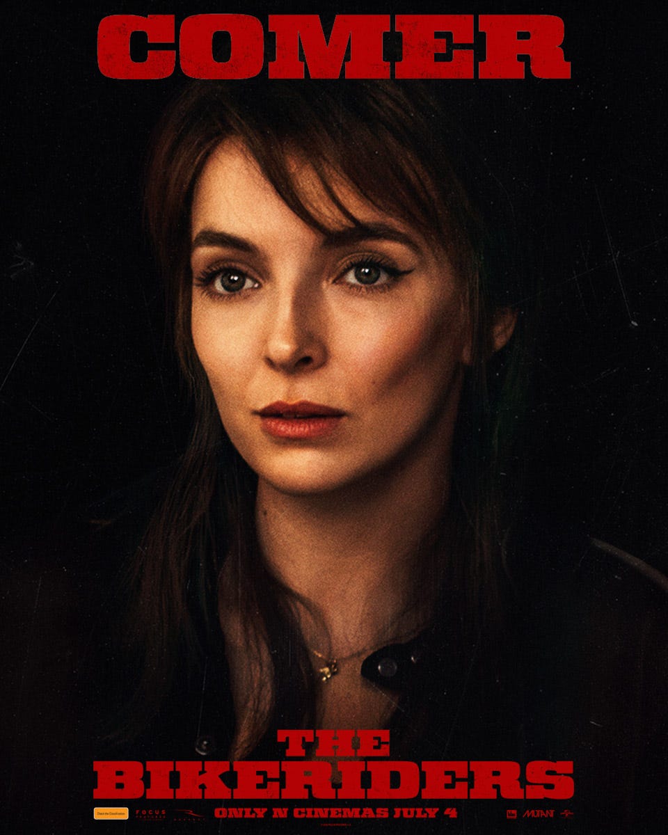
Ha, “comer.” I don’t think I’ll ever be able to see Jodie Comer’s name and not chuckle a little in my head. Goes double when it’s right up there above the title with no modifier. I didn’t plan to have this poster first by the way, the batch image adding function just decided on its own. I usually like to bury my crudest jokes later in the newsletter, but that’s impossible when the very first one was “COMER” right at the top. I’m not made of stone!
Anyway, it’s called The Bikeriders, and it’s from Jeff Nichols (Mud, Take Shelter). There are a couple other character posters for this one further down, but they ended up out of order for whatever reason. It’s about motorcycle gangs, obviously. And if I know one thing about Jodie Comer, that bike’s going to get ridden hard and put away wet. (I’m sorry).
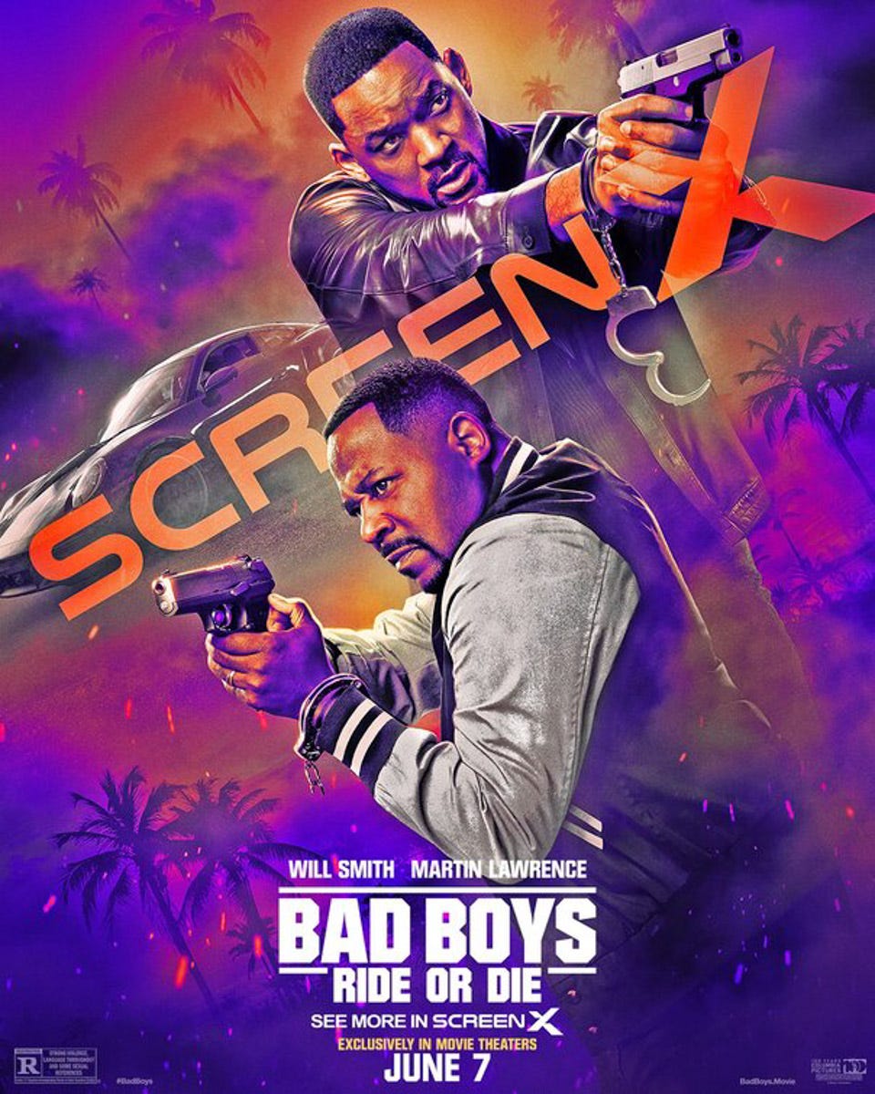
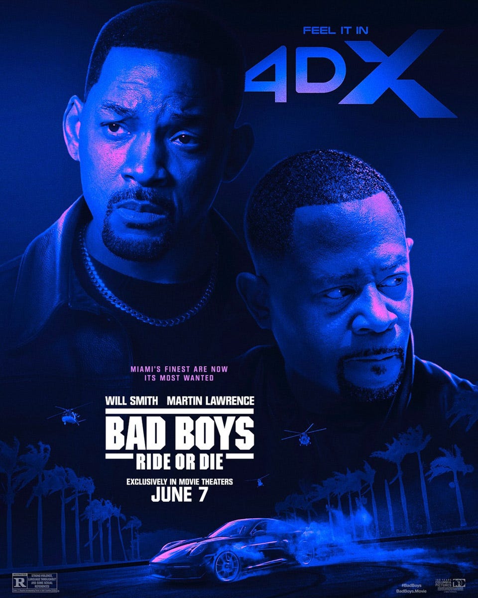
Speaking of out of order posters, here’s another one-of-many-in-a-series poster for Bad Boys: Ride or Die. No idea where those sparks are coming from, but as we’ve noted here on This Week In Movie Posters, non-diagetic sparks is poster code for “BIG EXCITEMENT.” (In a world… where metal is grinding… somewhere…)
I also enjoy that there’s a Porsche up there. In the DVD commentary of the first Bad Boys (I think?), Michael Bay talks about how that’s his Porsche and how sad he was that he sold it. Normally directors talk about the scene, how they shot it, why it works or doesn’t, etc., but not Michael Bay. Michael Bay just says stuff like “That’s my Porsche. Gosh what a cool car that was. I should get another really cool car and put it in a movie and also drive it around town. I like fast cars. Fast cars look cool. When you drive fast car, people turn to look. Red ones ‘specially look fast…”
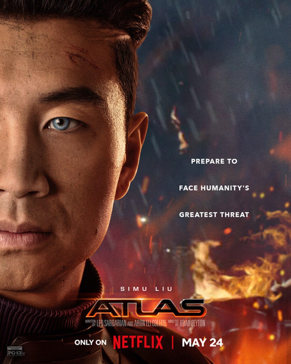
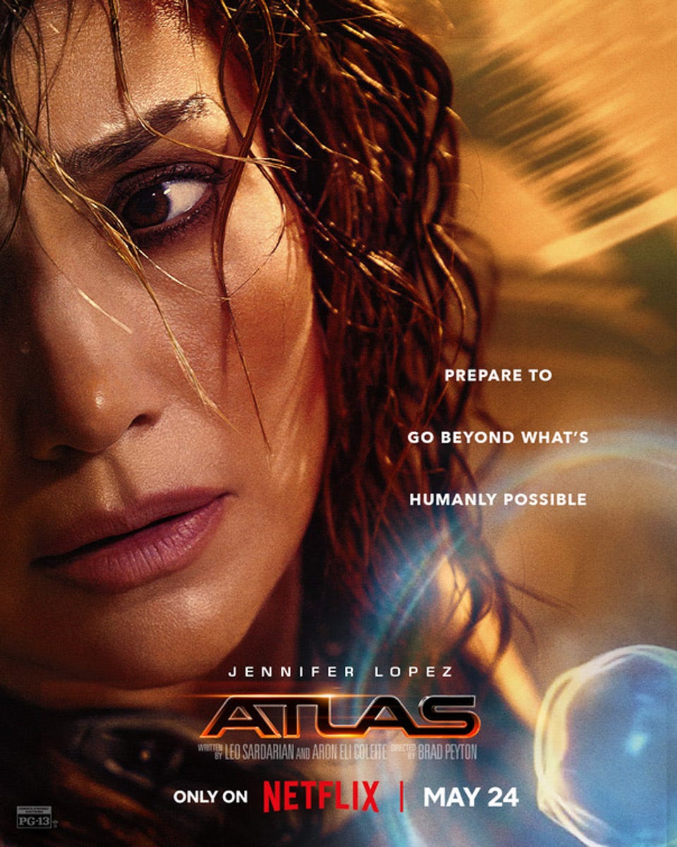
Continuing our trend of out-of-order posters, here’s one of a series of posters for Atlas, a new action movie on Netflix that you’re probably only just hearing about today because Netflix.
I don’t know what it’s about, but mostly I just wasn’t prepared for how much Simu Liu with blue eyes was going to look like Barry Keoghan.
In a bleak-sounding future, an A.I. soldier has determined that the only way to end war is to end humanity. [IMDB]
A “bleak-sounding future?” Jeez, even the guy writing the synopsis sounds like he’s only hearing about this secondhand.
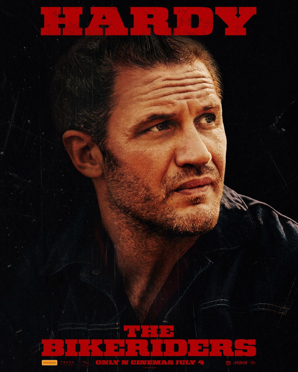
Here’s another for The Bikeriders. I hear your mom plays the bike. AYYYYY OHHHH, jk jk.
Tom Hardy looks like he’s doing the “that’s bait” face from Fury Road. Normally I’d worry about an actor going back to the well too many times, but I could watch Tom Hardy notice and point at stuff for hours. He’s sort of like a handsome grown-up version of my toddler. (*mumble mumble*) (*eyebrow raise, pointing*) Yellow bus over there.
That’s right, Tom! It’s big AND yellow! What else do you see??
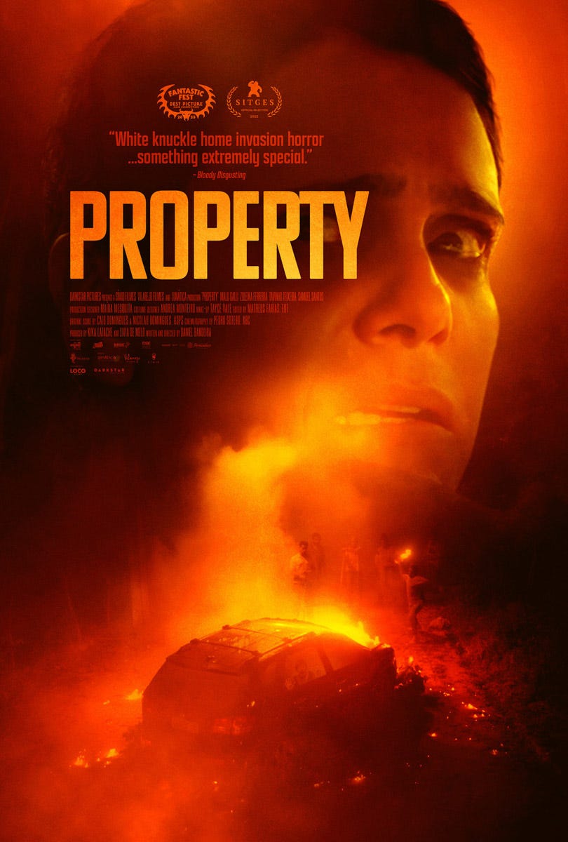
She’s horrified by something! What could it be?? Oh! It looks like some teens have torched her car. Those danged teens! Looks like she’s disturbed a whole nest of them. That’s going to be trouble.
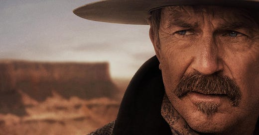
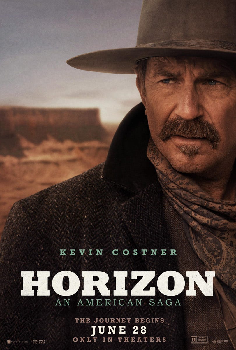
Here’s one of many new posters for Kevin Costner’s partially-self-financed Western, Horizon. I guess it just played at Cannes. Read someone call it a “boondoggle,” which I think is bad. Knowing Cannes, that means it probably only got a single-digit minute standing ovation afterwords.
Anyway, I don’t know the whole plot and I don’t feel like looking it up, but it seems fairly self-explanatory anyway. I kind of just think Kevin Costner realized how good he looked in a big ol mustache and wasn’t ready to give it up. Can you blame him? That’s a good mustache. That’s a mustache so good it convinces you to divorce your wife even if you love her.
By the way, did we really need “An American Saga” in the subtitle? Seems kind of redundant, what with the cowboy hats and mesas and stuff, no? Admittedly when I first heard the title, I did assume it was about the oil rig. I’m not sure the subtitle fixes that problem though. Maybe just go with a different word? Are we that married to “horizon?” Vista, vanishing point, sky place, get chat GPT on this one.
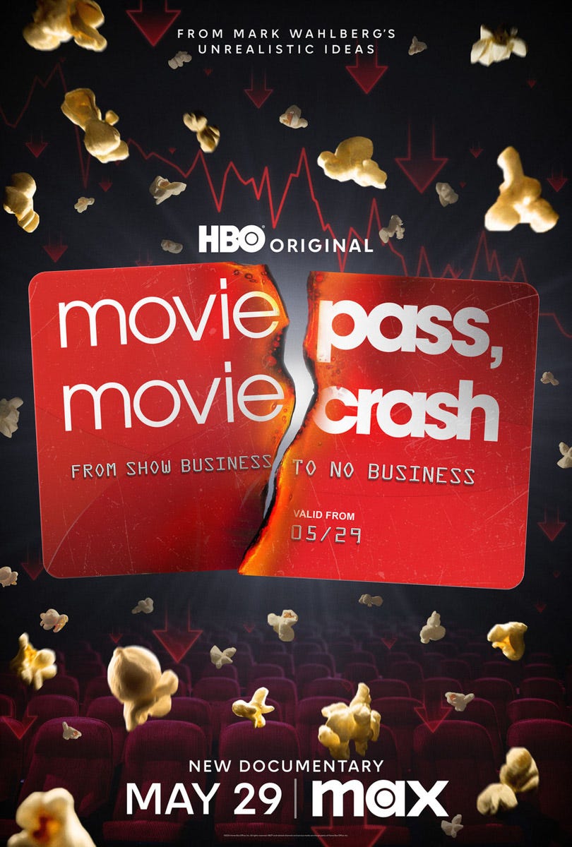
This is obviously a poster for a documentary about Moviepass, but the words at the top threw me. “From Mark Wahlberg’s unrealistic ideas.”
For a second I wondered, “wait, was it Mark Wahlberg who came up with the idea for Moviepass?”
Then I thought no, that couldn’t be right, that’d be like finding out my dog invented beanie babies (get Jerry Seinfeld on that movie). And so I sat here staring at it, trying to parse From Mark Wahlberg’s unrealistic ideas, until it dawned on me that “Unrealistic Ideas” is a production company owned by Mark Wahlberg.
It seems, then, that this confusing poster is the combined result of naming your documentary company “Unrealistic Ideas,” which isn’t that weird, and then putting your name in front of the production company, which isn’t that weird, and then putting your production company above the title, which isn’t that weird either. But then taken together they create this weird effect, being much more confusing illuminating, especially for a straightforward documentary about a thing most of us remember, arguably the most self-explanatory kind of movie a person could make.
I think the name is a problem. When I think “MARK WAHLBERG’S UNREALISTIC IDEAS,” I don’t think “documentary production company,” I think “thinking he could’ve stopped 9/11,” or “working out at 3 am.”
Haha, there’s the Porsche again. Michael Bay actually didn’t direct this one (that would be Adil El Arbi and Bilall Fallah), but it wouldn’t surprise me if he used the production to buy himself a new Porsche. Also, how is Martin Lawrence only 59? I feel like he’s been famous since I was in middle school and I take blood pressure medication.
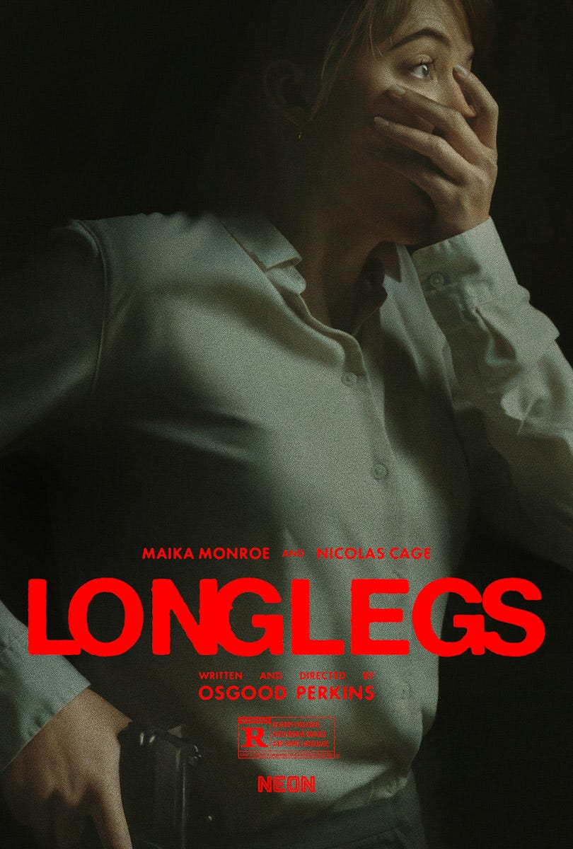
Does the hand look weird to anyone else? It looks like it’s too small for her shirt cuff and maybe also too small for her face. I like the “curiosity gap” idea, making us wonder what she’s horrified by, and it feels like a power move for an indie movie that has Nic Cage in it not to blast his face all over the poster, but the hand has me all distracted.
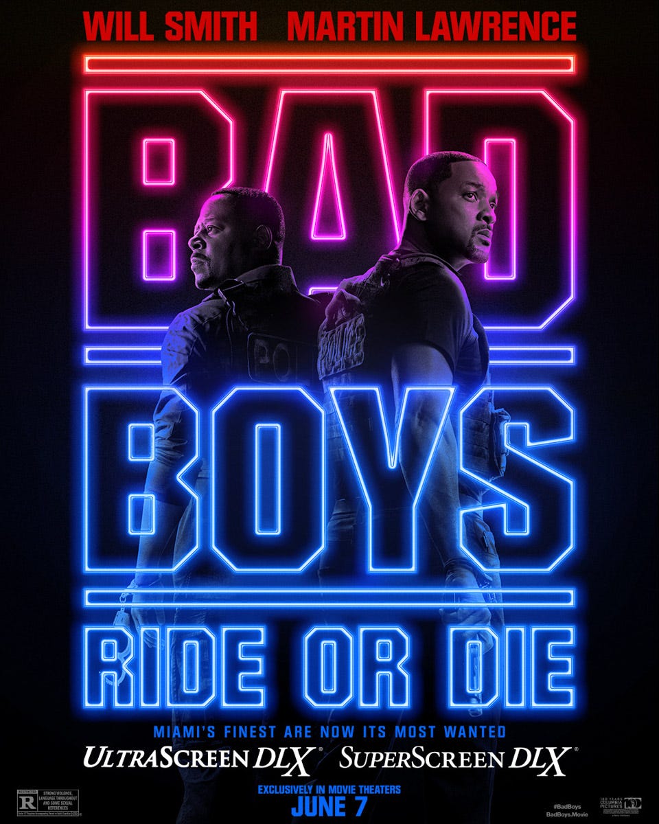
Neon! Of course they couldn’t match the faces with the names, that would’ve been too easy. Anyway, the neon motif is still kind of cool, and this one gives us a look at the title, which it’s only had for a few weeks even though the movie is almost out. Last week I got PR emails that still had “Untitled Bad Boys Sequel” in them.
So there ya go, it’s called “Bad Boys Ride Or Die.” It’s the fourth one, but they already used “Bad Boys for Life” on number three (Bad Boys 4 Life!). Even worse, “The Bad Boys Are Back In Town” was right there.
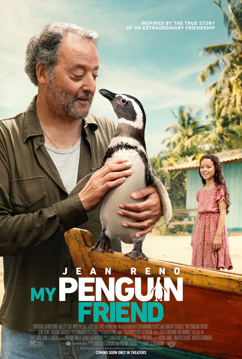
Wow, from The Professional to this. If I know anything about Jean Reno, he’s going to teach that penguin to be a hitman (and maybe fall in love with it even though it’s totally problematic).
I don’t know how you really do an eyeline match between a human and a penguin but I know that this ain’t it.
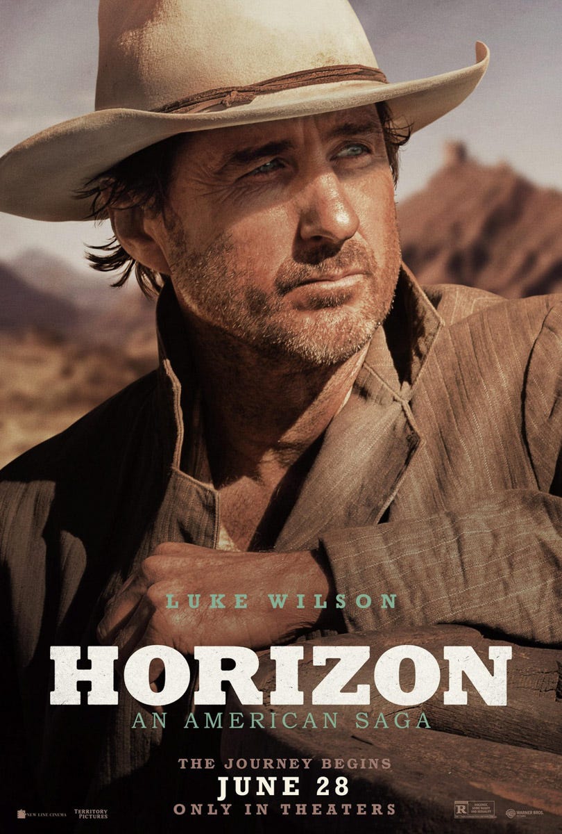
I don’t think I ever really noticed how well suited Luke Wilson’s big ol’ lantern jaw is to playing a cowboy before. It works! Get this guy in more cowboy stuff.
What’s he staring at, you think? Probably the horizon, I imagine.
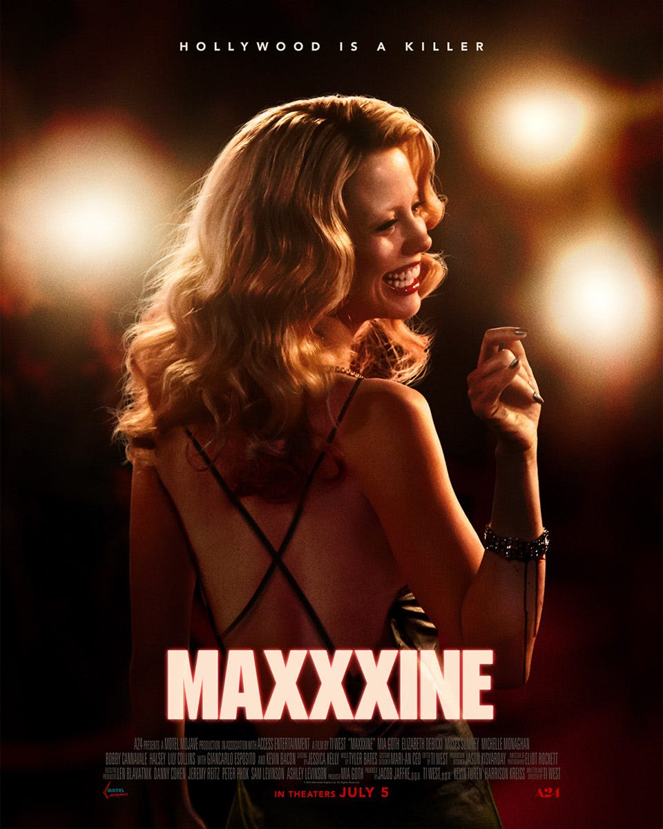
From X to Pearl to Maxxxine. It’s A24, they don’t need to telegraph their sequels. If you’re not cool enough to know that Maxxxine is a sequel to X and Pearl, you don’t get in, simple as that. You have to go watch Yellowstone four or whatever with all the other suburban hogs. Anyway, this one apparently covers Maxine moving to Hollywood and becoming an actress, and the Night Stalker is also involved somehow. I had to check Wikipedia for that, the poster mostly just looks almost distinguishable to the ones for the Amy Winehouse biopic.
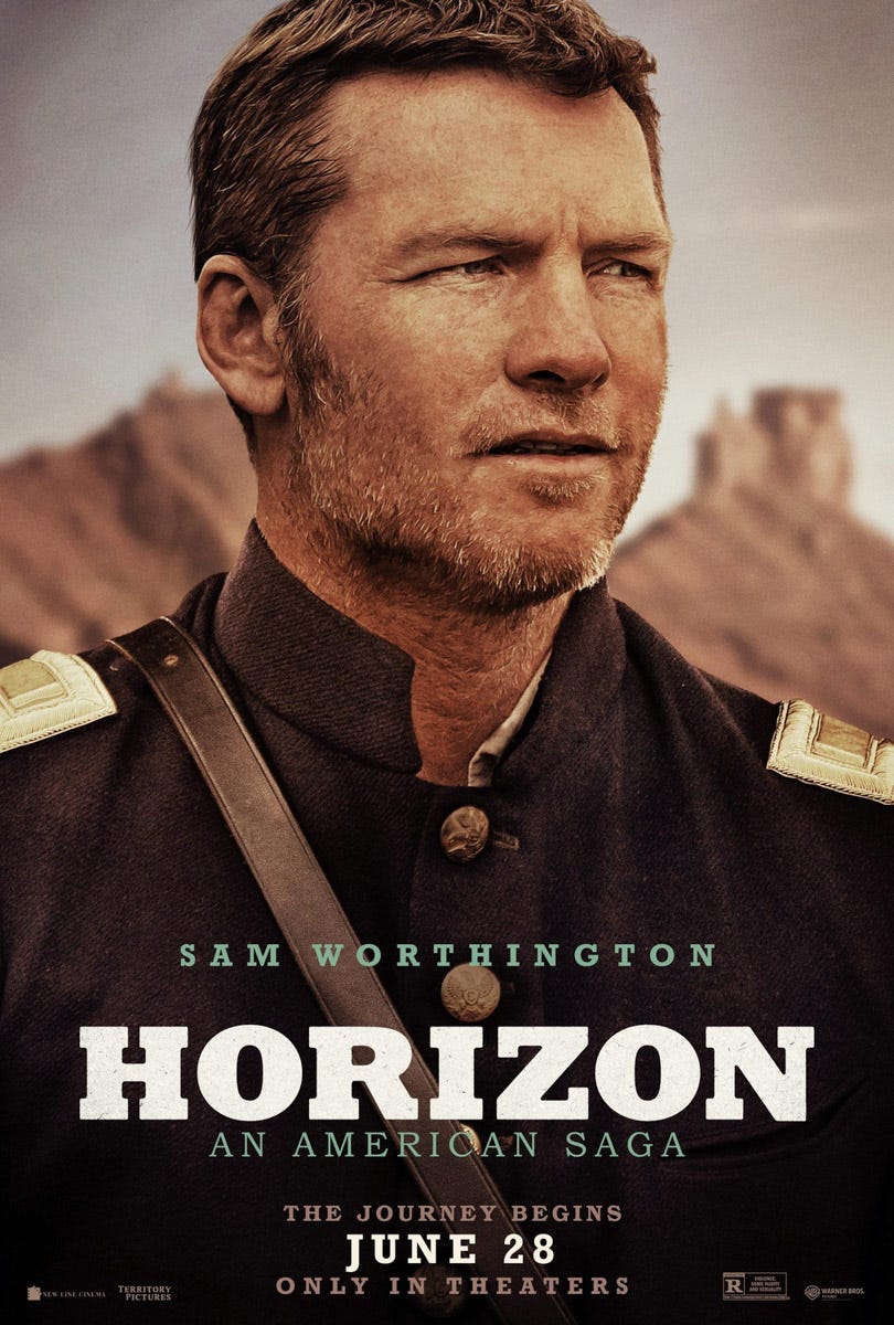
Aw yeah, he’s back, baby! Remember Sam Worthington?? Hollywood tried super hard to make him happen back in 2010 or so and everyone hated it. But I’m going to the be Sam Worthington defender here. He’s not that bad! He just had the misfortune of being foisted upon the public in the era of the terrible post-converted 3D movie cash grab.
I would tell you once again to go see the Australian movie Dirty Deeds from 2002, which he’s great in (alongside Bryan Brown, the best Australian character actor of all time, and Sam Neill, the best Australian actor of all time who is actually from New Zealand) but it’s so damned hard to watch anywhere that there are times I wonder whether I hallucinated it.
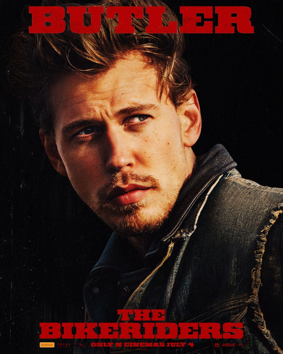
The most impressive thing about Austin Butler is that he feels like he’s doing too much even in a still image. Can you take it down a notch, man?
I’ll admit, I have a hard time buying Jennifer Lopez as a Ripley-esque sci-fi heroin. And that’s not because she can’t act (she was notably great in Hustlers and Out of Sight). I think it’s mostly because her makeup always looks like it does in this picture. Oh, you’re running from aliens all sweaty and shit but your makeup still looks like that? Smokey eye technology must have really come a long way in the future.
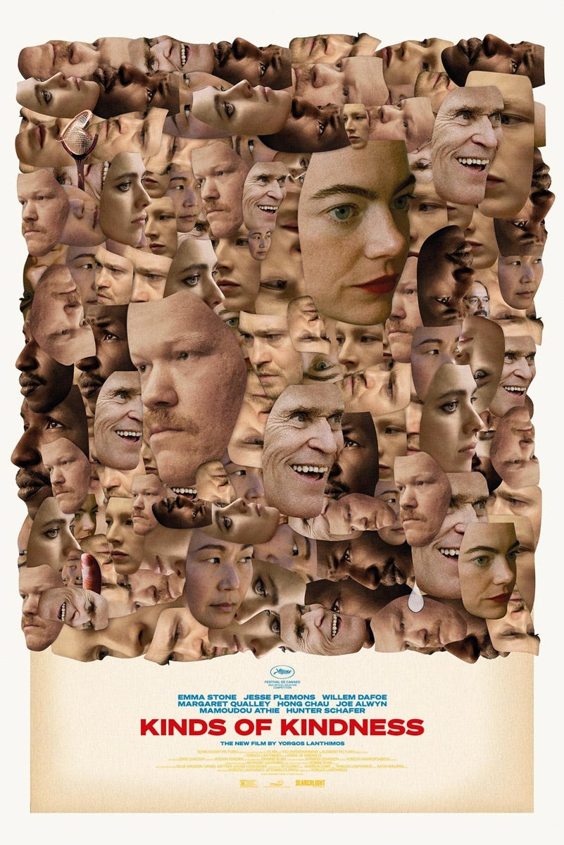
Yorgos Lanthimos, with Emma Stone, Hong Chau, Willem Dafoe, Michael B. Jordan, and Jesse P. Lemons? Oh yeah, give it to me. These actors are all great and Yorgos shreds. Perfect poster. Hits all the selling points without looking like a dull floating head design.
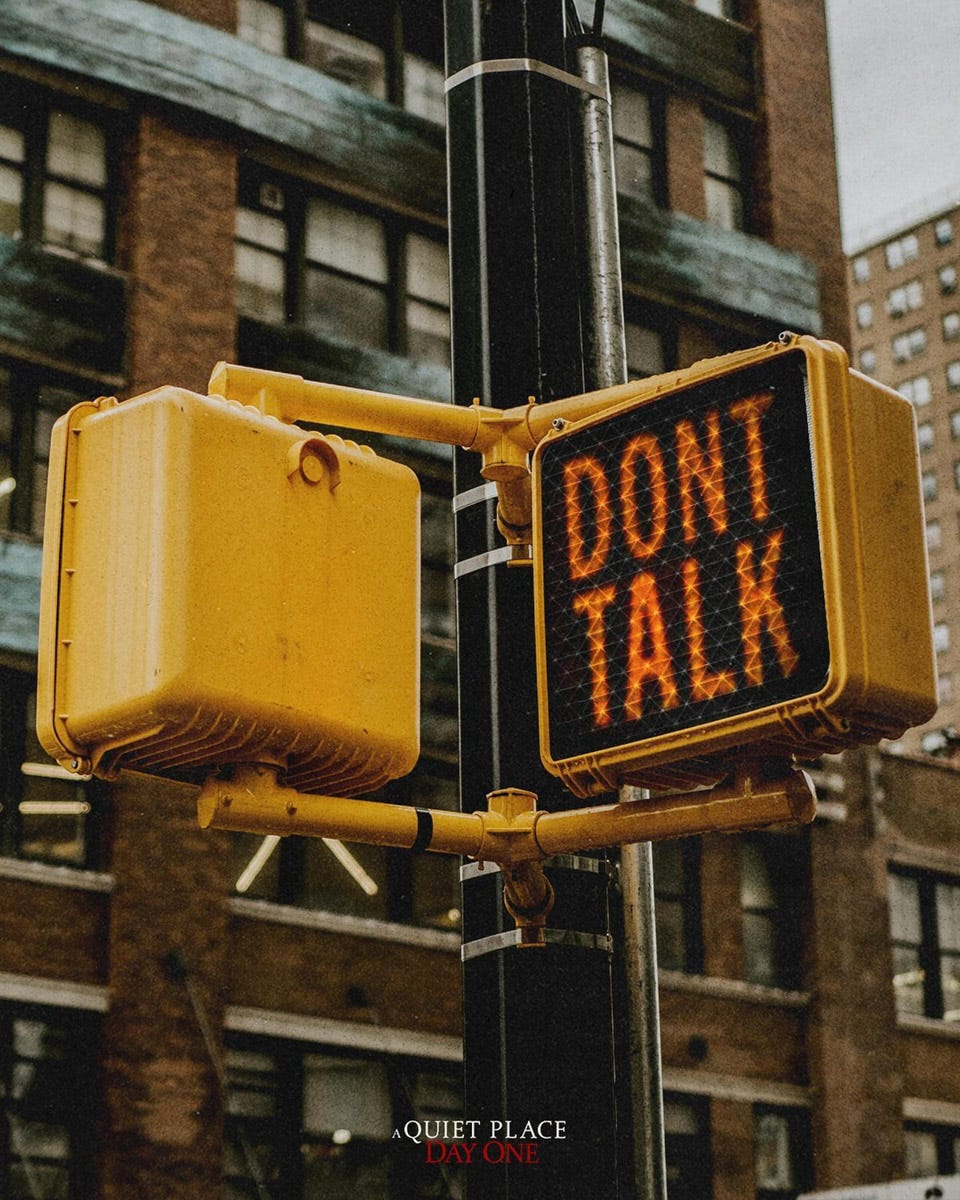
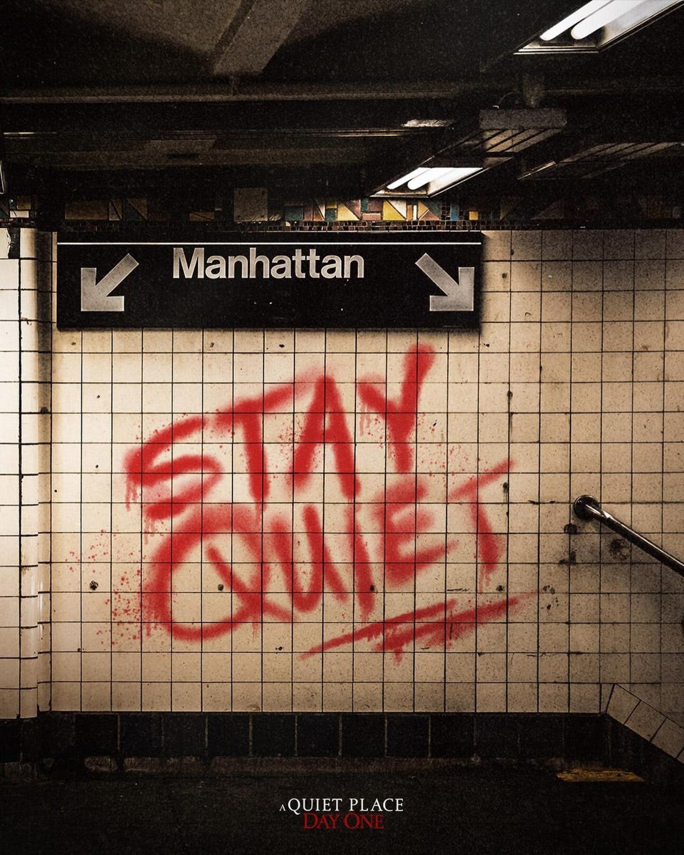
I could use a sign like this for a lot of people in my life. Anyway, this poster is for A Quiet Place: Day One, which is actually the third A Quiet Place movie. Am I crazy or wasn’t the last one already a prequel/origin story? How many do we need?
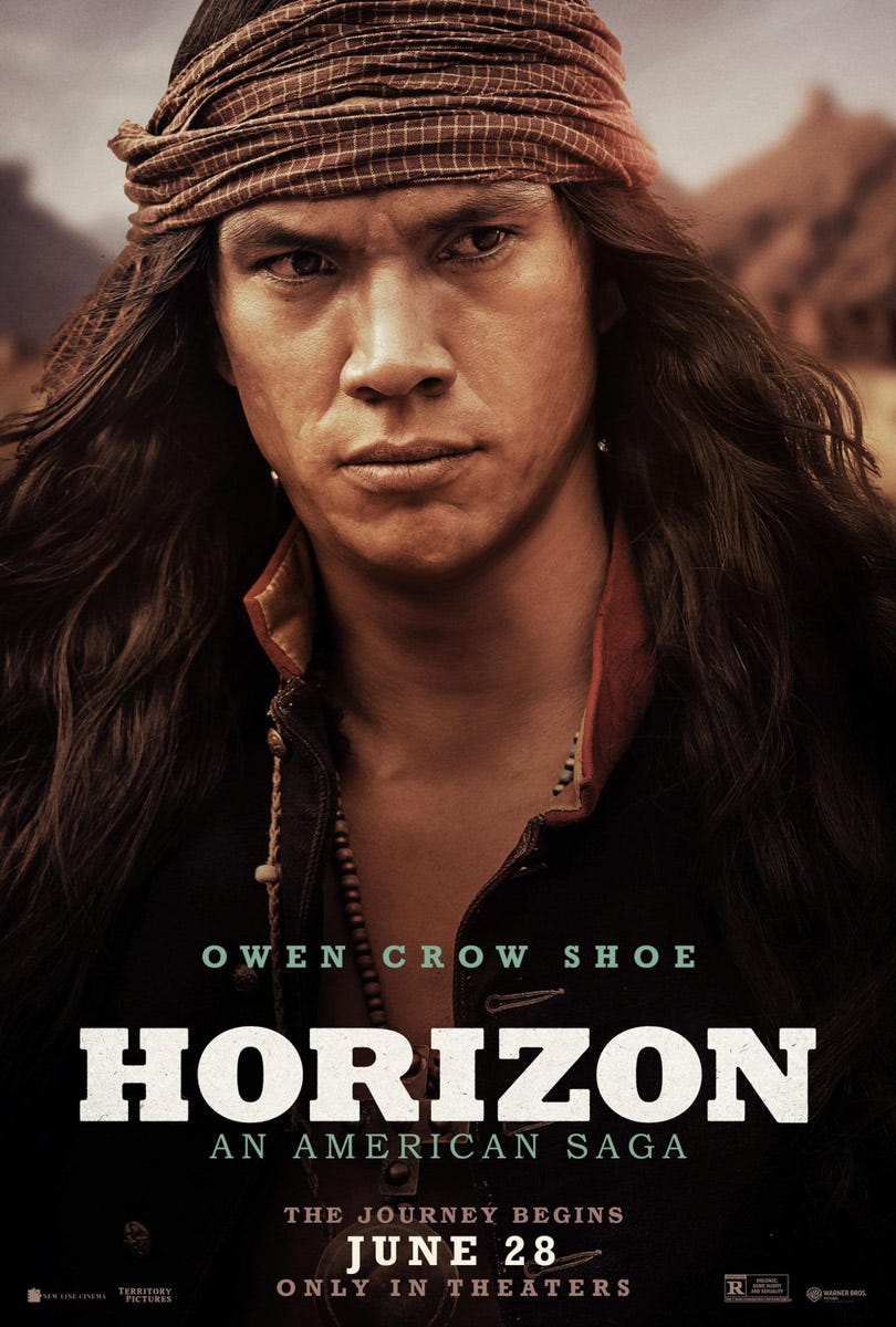
This is Owen Crow Shoe. Good face, good name, no notes.
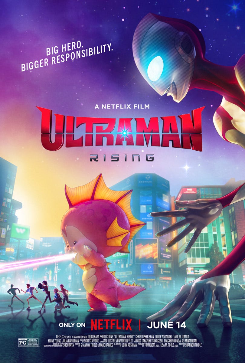
Ultraman Rising! I guess there’s a little pink baby Godzilla. I’m okay with that. Whatever it takes to get Roku and Netflix to stop advertising Blippi and the Ryan’s Toy family shows on the home screen. I swear on all that is holy, if you people ever get my child into that drivel I will drive to your headquarters and do something I regret.
“Big hero, bigger responsibility” is like if you asked AI to explain the theme of Spider-man.
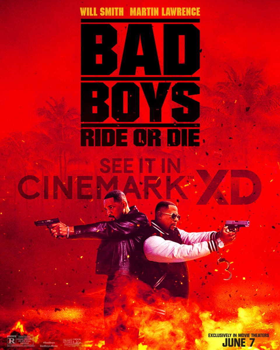
Oh my gosh, look at all those sparks! Sparks AND dirt clods! This is going to be insane! I get that the palm trees are supposed to convey “Miami” but the poster sort of makes it look like they dropped them into a Vietnam War movie.
Charlie don’t surf? Oh hail naw! (*spinning camera shot of them firing pistols*)
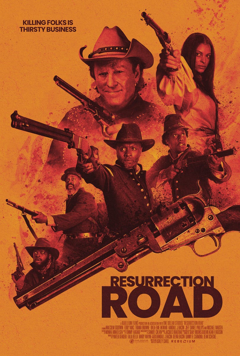
Cool poster for Resurrection Road, but maybe not enough guns? Just a thought.
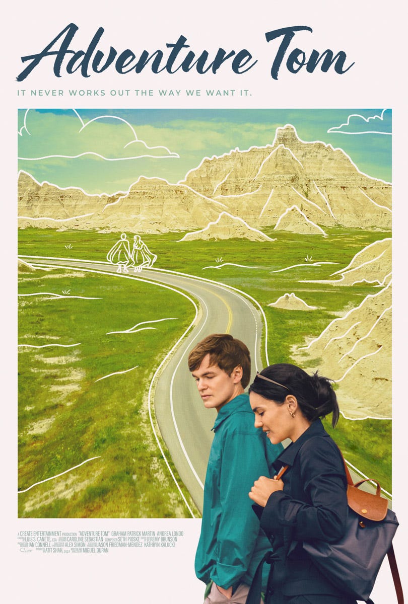
Adventure Tom! I don’t know, that guy doesn’t look super “adventurous” to me. He looks more like a guy who has opinions on spreadsheet shortcuts. Maybe romance is his greatest adventure?? Hmmm.
Anyway, this looks like one of those rom-coms where “the city is like another character,” only for people who shop at REI. That’s cool, us suburban hogs need romantic comedies too. Just having introspective moments next to the Panera bread and shit.
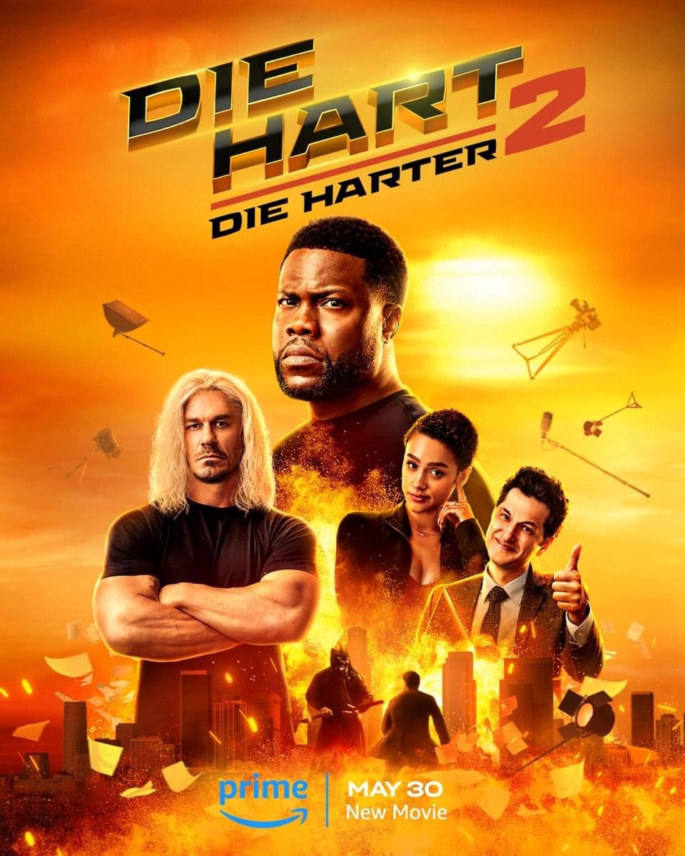
It seems weird that I hadn’t heard of a movie with Kevin Hart and John Cena in it that’s opening this week, but apparently this all started as a show on Quibi in 2020. It was recut and released on Prime in 2023, and now there’s a sequel! Apparently it’s a lot like Tropic Thunder, only instead of Ben Stiller’s cutting showbiz satire, it’s Kevin Hart, a guy who’s just really happy to be roasting Tom Brady or whatever.
These Quiet Place Day One movies probably work much better as a whole series, but, alas. By the way, how many sequels before the marketing can just assume we already understand the concept?
Yes, I saved arguably the biggest poster drop for last (not on purpose, again, this batch image add function totally has a mind of its own).
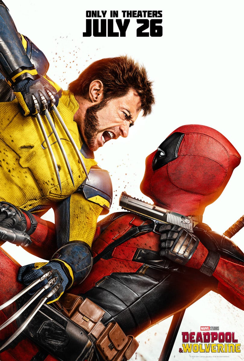
It’s Wolverine! And Deadpool! In the same movie! …Gosh!
I like the poster. Strong color scheme on the costumes, which look like they have a little texture to them, and aren’t just shiny plasticky CGI crap. That being said, whenever I see a guy with that face and that monochromatic of hair, I think “Who are we kidding here, man?”
Take a lesson from Larry David and Leslie Nielsen, just go gray early and you’ll never age a day in your life. You can go gray at age 30 and look basically the same until you keel over at 95.
Anyway, I know Wolverine’s whole deal is not aging so I’m sure there’ll be a joke about that in there somewhere. This commentary is more for an older guy in my neighborhood. Get a freakin’ clue, Dave, you aren’t fooling anyone.



There is an actual train station in Toronto called "Old Cummer station." I swear I am not making this up.
I'm a staunch Bad Boys proponent but this new one...I don't know, man. It kind of makes sad and I'm guessing that's not what they were going for.